In recent years, mobile devices have become the primary means of accessing the internet for a significant portion of the population. This shift has led to a fundamental change in the way websites and applications are designed, with many designers and developers adopting a “mobile-first” approach to design. In this article, we’ll explore what mobile-first design is and why it matters in today’s digital landscape.
What is Mobile-First Design?
Mobile-first design is an approach to web design and development that prioritizes the design and development of a website or application for mobile devices, rather than for desktop computers. It involves creating a design that is optimized for the smaller screens, limited processing power, and slower internet connections of mobile devices. This approach ensures that the website or application is accessible and usable on mobile devices, which are becoming the primary means of accessing the internet.
Why Does Mobile-First Design Matter?
- Mobile Usage is Increasing
Mobile usage is increasing at an unprecedented rate, with more than half of all internet traffic coming from mobile devices. According to Statista, mobile devices accounted for 52.6% of all website traffic in 2019, and this figure is expected to increase to 61.6% by 2023. This means that more and more people are accessing websites and applications on their mobile devices, making it essential for designers and developers to prioritize mobile-first design.
- Improved User Experience
Designing for mobile devices first ensures that the user experience is optimized for smaller screens and touch-based interfaces. This approach can lead to a more streamlined design, with a focus on the essential elements of the website or application. Mobile-first design forces designers to think critically about the content and features that are most important to users, leading to a better user experience overall.
- Faster Loading Times
Mobile devices typically have slower internet connections than desktop computers. Therefore, designing for mobile-first means creating a website or application that is optimized for faster loading times. This can be achieved through techniques such as compressing images, minimizing code, and reducing the number of HTTP requests. A faster-loading website or application leads to a better user experience and can improve search engine rankings.
- Increased Accessibility
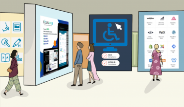
Mobile-first design makes websites and applications more accessible to a broader range of users. This includes users with slower internet connections, users with smaller screens, and users with disabilities. By prioritizing the design of a website or application for mobile devices, designers can create an experience that is accessible to all users, regardless of the device they are using.
Conclusion
In today’s digital landscape, designing for mobile-first is no longer an option but a necessity. With mobile usage on the rise, it is essential to create websites and applications that are optimized for mobile devices. Mobile-first design ensures a better user experience, faster loading times, increased accessibility, and better search engine rankings. By prioritizing mobile-first design, designers and developers can create websites and applications that are accessible and usable to all users, regardless of the device they are using.