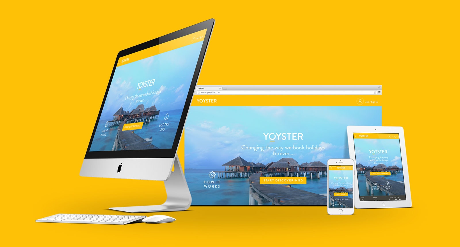
With the rapid growth of mobile devices, the need for responsive design has become increasingly important. Responsive design is the practice of creating websites that are designed to adapt to any screen size, whether it be a desktop computer, tablet, or smartphone. In this article, we’ll explore the importance of responsive design and provide some tips for creating a responsive website.
Why Responsive Design is Important
The main benefit of responsive design is that it ensures that your website will look great and function properly on any device. With so many people accessing the internet on their smartphones and tablets, it’s essential that your website is easy to use and navigate on these devices.
Another important benefit of responsive design is that it can improve your website’s search engine rankings. Google has stated that it prefers responsive design over separate mobile and desktop sites because it makes it easier for their bots to crawl and index your site. In addition, responsive sites are more likely to be shared and linked to, which can also help improve your search engine rankings.
Tips for Creating a Responsive Website
- Use a responsive design framework: One of the easiest ways to create a responsive website is to use a responsive design framework like Bootstrap or Foundation. These frameworks provide pre-built components and layouts that are optimized for different screen sizes.
- Optimize images for the web: Large images can slow down your website and make it difficult to load on mobile devices. To ensure that your website loads quickly on all devices, make sure to optimize your images for the web by compressing them and reducing their file size.
- Use flexible layouts: To create a truly responsive website, you need to use flexible layouts that can adapt to different screen sizes. This means using flexible units like percentages instead of fixed units like pixels.
- Prioritize content: On smaller screens, it’s important to prioritize your content and only display the most important information. This means using a minimalist design and only including essential elements on your website.
- Test on multiple devices: Before launching your website, make sure to test it on multiple devices to ensure that it looks and functions properly on all screen sizes. You can use tools like BrowserStack or Device Mode in Chrome DevTools to test your website on different devices.
Conclusion
Responsive design is essential for creating websites that are accessible and easy to use on all devices. By following the tips outlined in this article, you can create a website that looks great and functions properly on desktop computers, tablets, and smartphones. With the increasing use of mobile devices, responsive design is no longer an option – it’s a necessity.